Checklist
Before asking anybody to proof read your paper, print it out in black and white, in full A4 size (not two pages per side), then ask yourself the following questions. The checklist and the talk that went with it can be found at http://peter.serwylo.com?p=191. This cheatsheet will live there, and if it is updated, I will upload the new version there too.
Writing
- Have you used LaTeX or something which outputs to LaTeX?
Images
- Have you retained the original aspect ratio?
-
Are vector graphics suitable?
- If so, have you used them?
-
If not, have you scaled your bitmap images?
- If scaled down, are they readable when printed?
- If scaled up, was there any other option?
- Have you minimized the use of dark backgrounds?
Charts
-
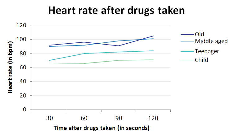
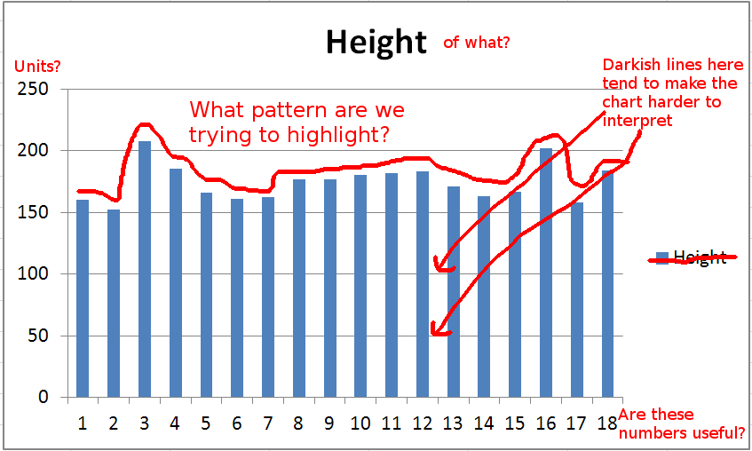
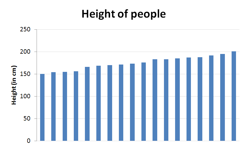
Have you decided what pattern you want to show?
- Is the data sorted to highlight this?
- Have you chosen the appropriate chart (e.g. line/bar) to highlight this?
-
Are all axes labeled (where appropriate)?
- Do axis labels include units?
- Is the background grid faint enough so as to not dominate?
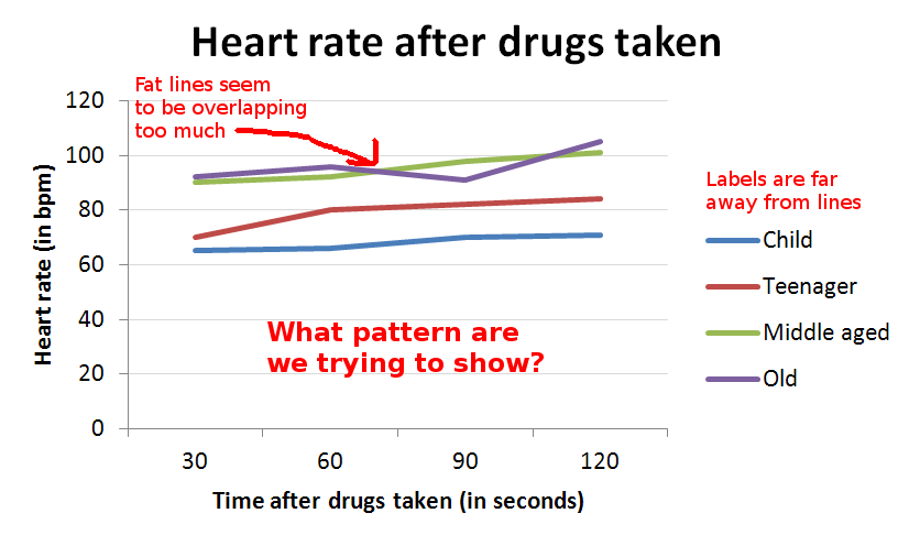
- Are the data labels on your line chart aligned more or less with the actual data lines?
-
Are the colours you’ve chosen appropraite?
- Do they print out nicely in black and white?
-
Do they show the pattern you want to highlight
- Diverging
- Converging
- Categorical
- Have you used something like http://colorbrewer2.org to choose colours? (Excel 2010 is good too)
More Details
This section will elaborate on the reasoning behind the checklist items above.
Images
Format
It is usually preferable to have vector graphics, rather than bitmap. These can be created using programs such as Inkscape or your favourite graphing software. Vector images that contain text will generally allow readers to select the text in the image. This is important if there are long or complex words in the image.
Quality
If you can’t have a vector image (your drawing tool of choice doesn’t support it, or it is inappropriate such as for photographs) then you will need to have bitmaps. When this is the case, never scale them up - don’t make them bigger than their original size. If you need to take a screenshot of something to put in your paper, make the size as large as possible before you take a screenshot. As a general rule of thumb, what you see on the screen will be about 1/3rd the size on paper - if it is printed at the same sort of quality.
Aspect Ratio
Except for extreme cases, it is highly unlikely that you’ll want to change the aspect ratio (width to hight ratio) of an image. It is especially important if the image has text in it, because people much smarter than us have spent years of research making fonts the way they are.

Charts
Excel can make beautiful charts, but by default, they tend to do a few strange things.
Colours
Older versions have a particularly bad set of default colours, although that has been rectified in newer versions. If you have Excel 2003 or 2007, think about using http://colorbrewer2.org to choose colours for you. As with font designers - cartographers and psychologists have been researching colours for much longer than you or I, so lets just stand on their shoulders.
Labels
If you only have one data series, then a data label is probably not needed. It may be easier to label the chart so that the data series is intuitive. If you have multiple labels in a line chart, there is no reason that they need to be in random order on the right hand side. Feel free to copy your chart into a drawing program, and move the individual labels up and down so that they line-up with the data lines. This is not always possible (if the lines are close together), but at least put them in the same order as the data lines.